




Layout
Graphic Design Skills.
This project highlights my skills in UI design, graphic composition and digital interface creation, with particular attention to typographic hierarchy, contrast, readability and visual balance. The turquoise, emerald green and deep blue colour palette ensures graphic consistency between the logo, the banner and the mobile application, while reinforcing the immersive and natural identity of Phang Nga Bay.


Graphic Approach
For this personal project, I designed a complete graphic direction around Phang Nga Bay in order to demonstrate my skills in visual identity, UI design and digital interface design. The work began with the creation of a logo inspired by the bay’s distinctive karst rocks, using a stylised graphic approach based on the simplification of forms, the construction of an identifiable silhouette and the use of layered volumes to evoke the relief, vegetation and water.
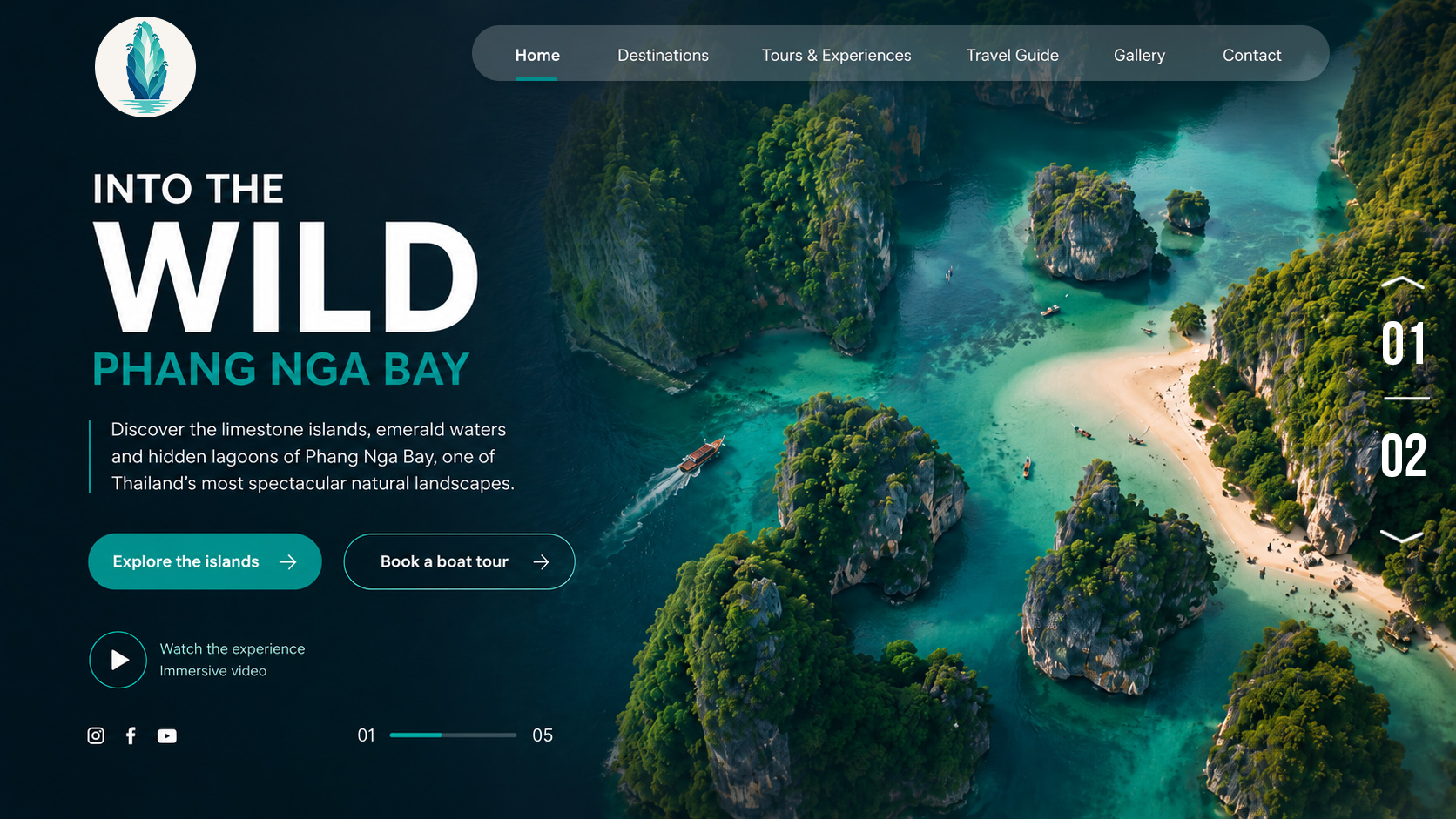
This visual identity was then applied to an immersive tourism banner, designed as the hero section of a modern landing page. I worked on the typographic hierarchy, readability over imagery, main navigation, CTA buttons, contrasts, breathing space and the balance between editorial content and visual impact. The colour palette, inspired by the turquoise and emerald-green waters of the bay, served as a guiding principle to ensure graphic consistency between the logo, the banner and the interface elements.
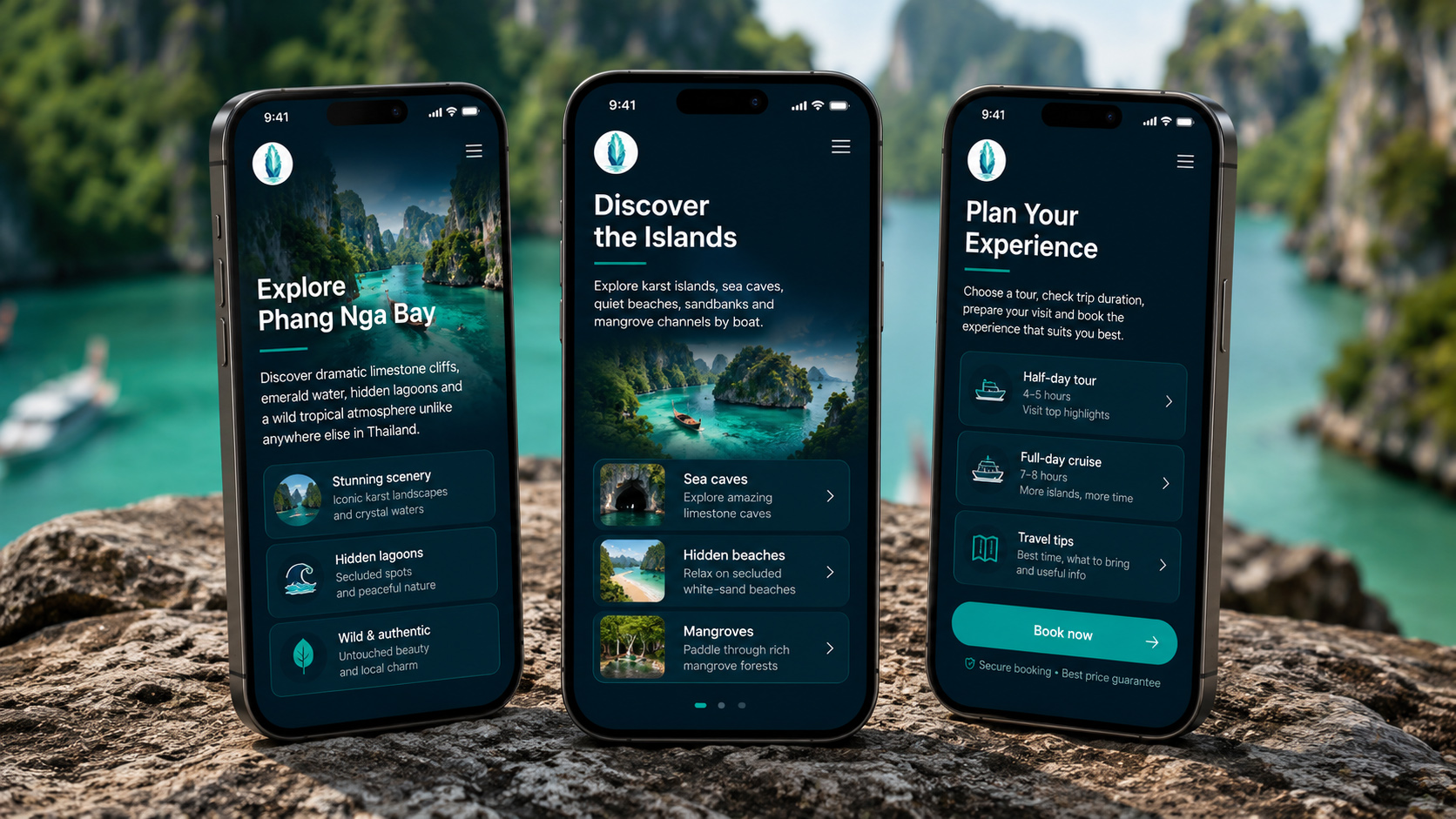
I then extended this visual universe into a mobile application, structured around three key screens: discovering the bay, exploring the islands and planning the experience. This adaptation allowed me to work on UI consistency, the layout grid, reusable components, content cards, call-to-action states and the responsive adaptation of the graphic identity. The objective was to build a cohesive, readable and professional visual system, capable of working across multiple digital touchpoints while enhancing the user experience, art direction and overall quality of execution of the project.
This project highlights my skills in UI design, graphic composition and digital interface creation, with particular attention to typographic hierarchy, contrast, readability and visual balance. The turquoise, emerald green and deep blue colour palette ensures graphic consistency between the logo, the banner and the mobile application, while reinforcing the immersive and natural identity of Phang Nga Bay.