



Layout
Graphic Design Skills.
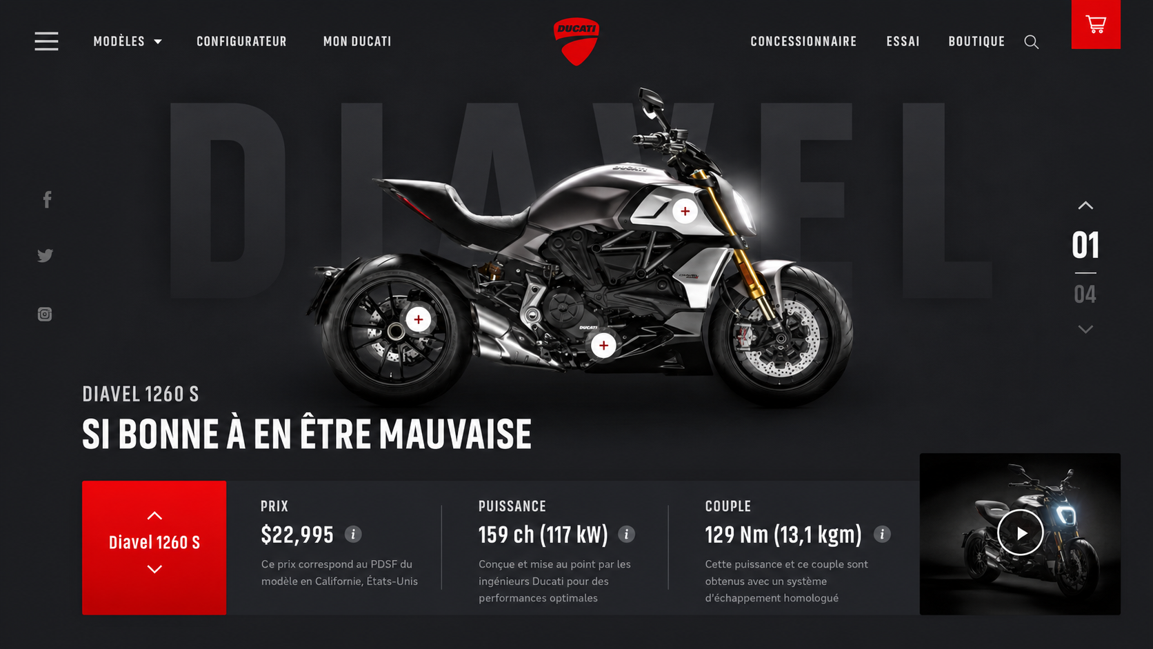
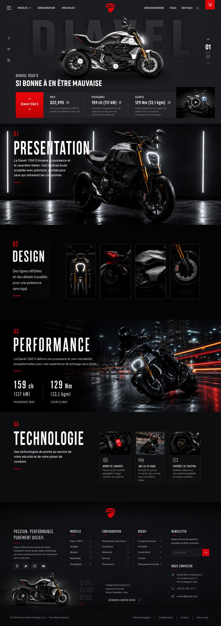
This project highlights my ability to build a premium interface from a strong art direction: grid-based composition, typographic hierarchy, contrast management, visual rhythm and image direction.
I worked on the balance between power, readability and immersion to create a fictional landing page consistent with the visual universe of the Ducati Diavel 1260 S.

Graphic Approach
For this project, I built the graphic approach around the logo, using it as the starting point for a complete visual system. The stylised tiger became the foundation of the entire art direction: its dynamic shapes, strong contrasts and balance between power and elegance were then extended into the landing page illustrations to create a consistent and instantly recognisable identity.
The graphic charter is based on a colour palette directly inspired by the logo, combining deep dark green tones with orange accents connected to the tiger’s fur. This contrast creates an immersive, premium atmosphere suited to a tourism-focused attraction. The typography reinforces this direction with bold, readable and impactful headings, while the layout is structured around clear horizontal sections, strong content hierarchy and visible calls to action. The goal was to transform the logo into a complete identity system, able to work across branding, illustration and interface design.
I designed the layout around a clear grid, balanced horizontal sections and a precise visual hierarchy. The graphic work combines composition, impactful typography, a consistent colour palette, readable CTAs and cohesive illustrations to create an immersive, professional and instantly recognisable interface.