


Layout
Graphic Design Skills.
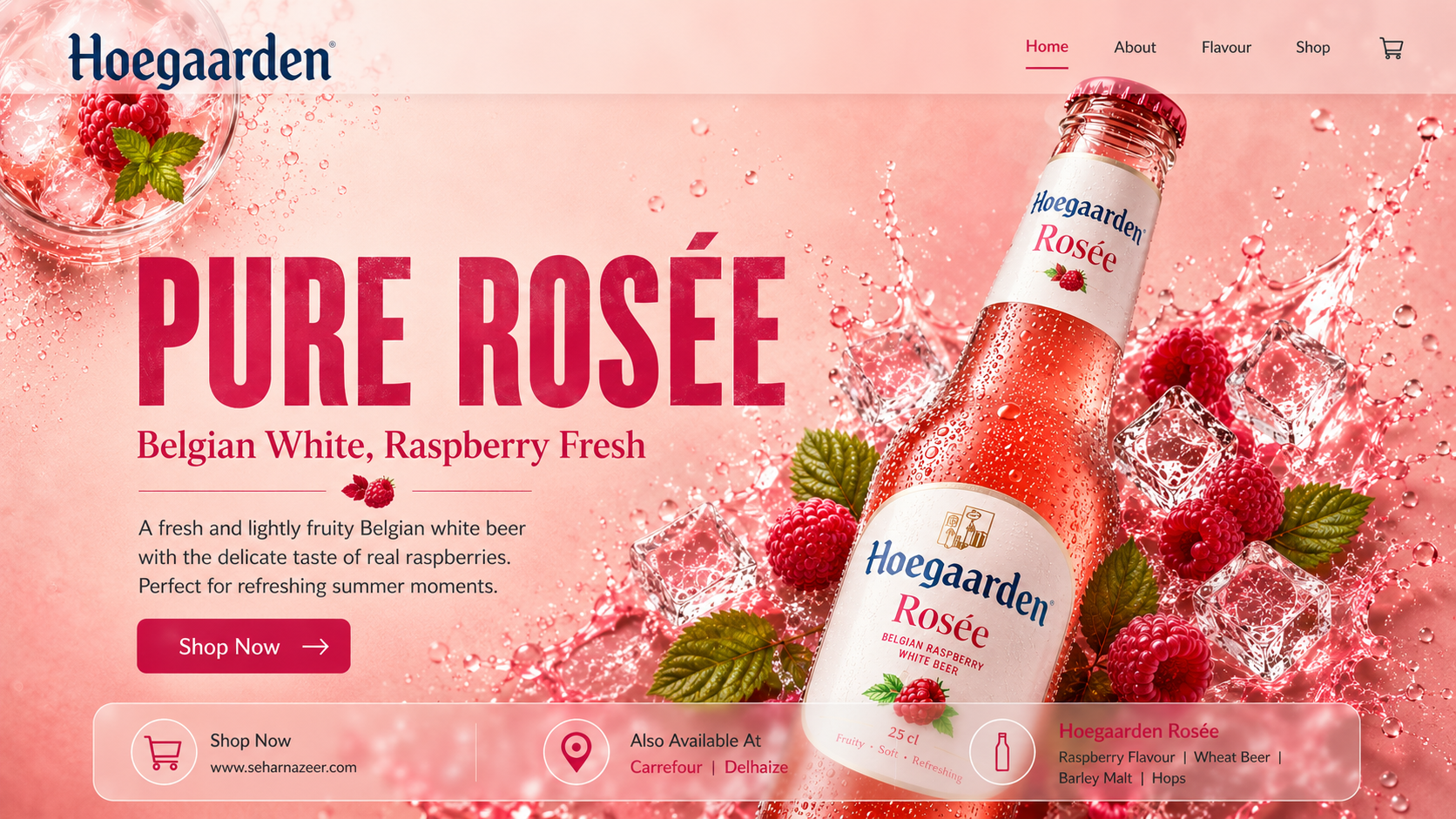
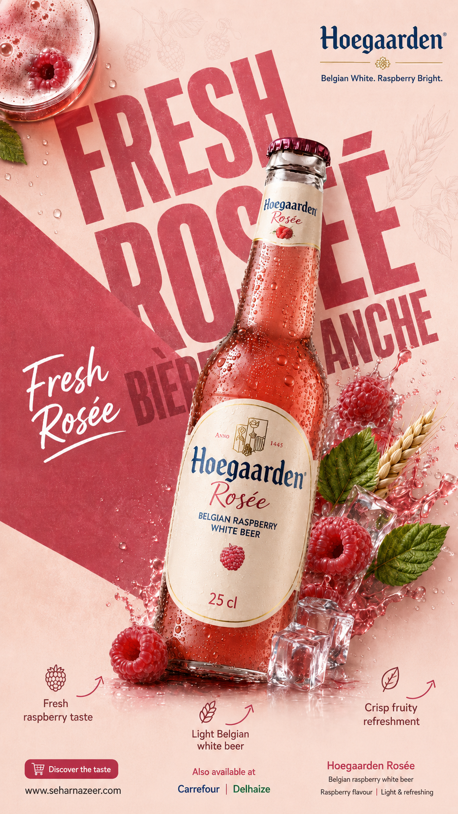
Creation of a fresh and premium graphic universe for Hoegaarden Rosée, based on a rosé colour palette, fruity visual direction and impactful advertising composition. Consistent adaptation across social media, web banner and landing page, with precise work on hierarchy, visual balance, CTAs and user experience.

Graphic Approach
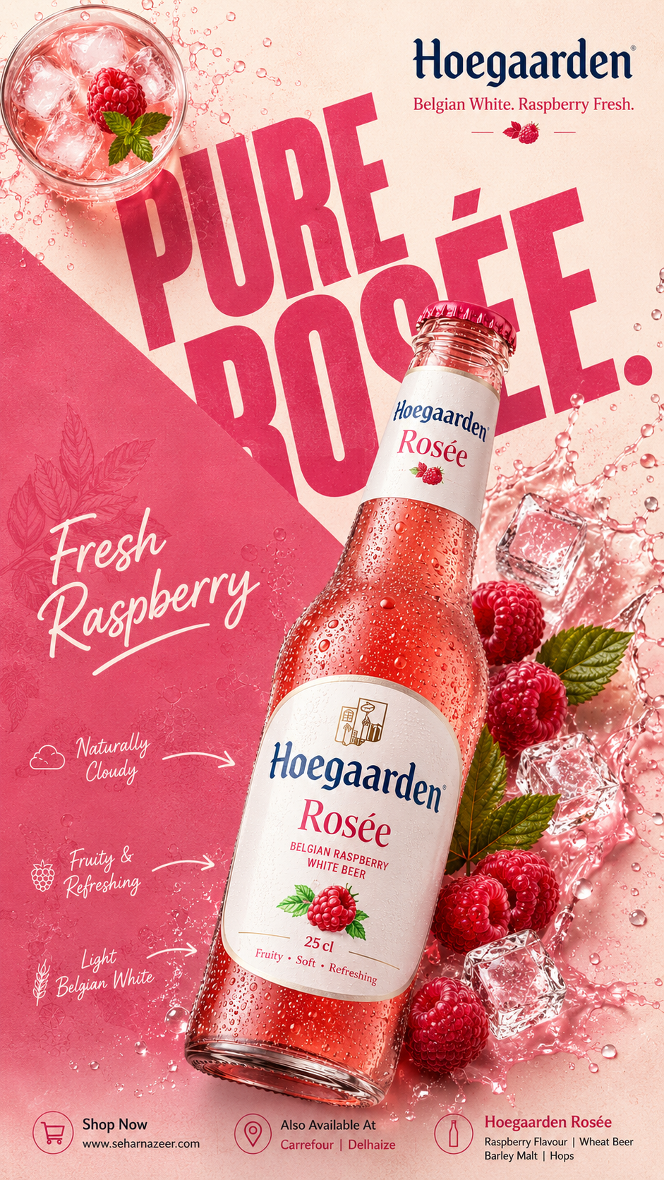
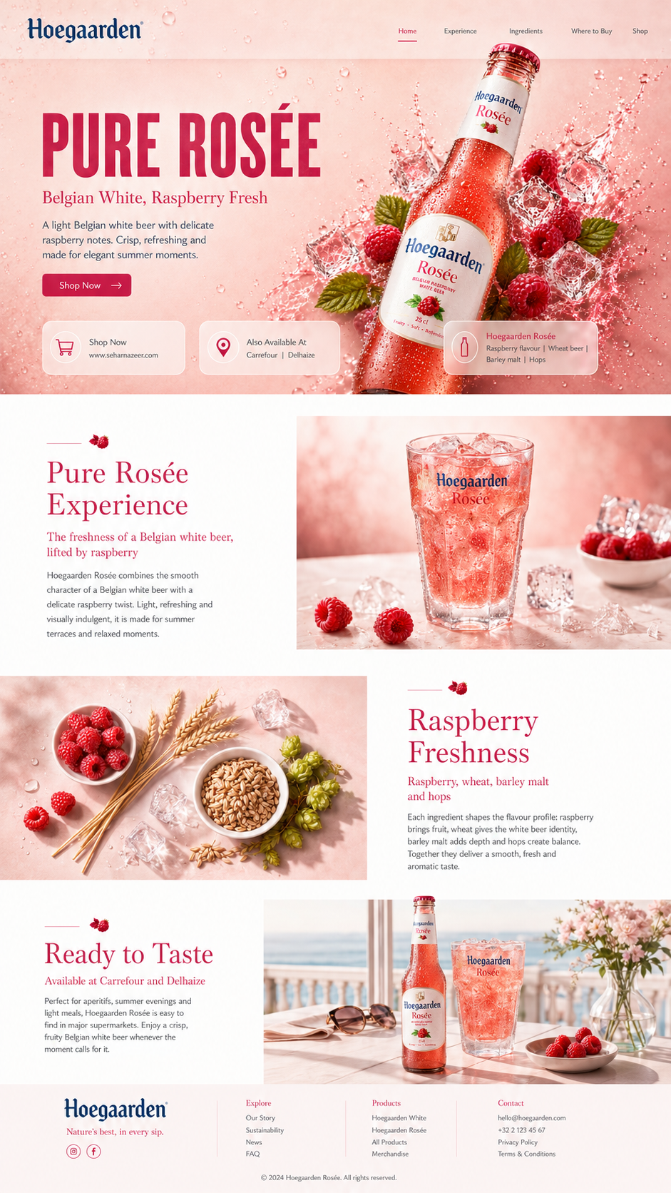
For this Hoegaarden Rosée project, my graphic approach was built around a fresh, fruity and premium visual universe, directly inspired by the rosé colour of the beer, its raspberry flavour and its positioning as a light and refreshing Belgian white beer. I developed a luminous palette combining raspberry pink, rosé red, creamy white and natural green accents, in order to create a coherent, indulgent and elegant visual identity.
This art direction was applied across several formats: social media advertising visuals, a web banner and a landing page. Each format was designed according to its specific purpose: immediate impact for social ads, clear hierarchy for the banner, and a more structured experience for the landing page. The goal was to maintain strong visual consistency while adapting the composition, visual rhythm and layout to the constraints of each medium.
I also worked on the UI approach to guide the viewer’s eye smoothly: H1/H2 hierarchy, short and readable copy, a visible CTA, and a careful balance between the product, ingredients and breathing space. Raspberries, ice cubes, water droplets and splashes reinforce the feeling of freshness, while the layout highlights the product without overloading the visual experience.
The overall design responds to a clear commercial objective: presenting Hoegaarden Rosée in an attractive, professional and coherent way, while demonstrating my ability to create a complete, adaptable graphic identity suited to a modern digital experience.
Creation of a fresh and premium graphic universe for Hoegaarden Rosée, based on a rosé colour palette, fruity visual direction and impactful advertising composition. Consistent adaptation across social media, web banner and landing page, with precise work on hierarchy, visual balance, CTAs and user experience.