



Layout
Graphic Design Skills.
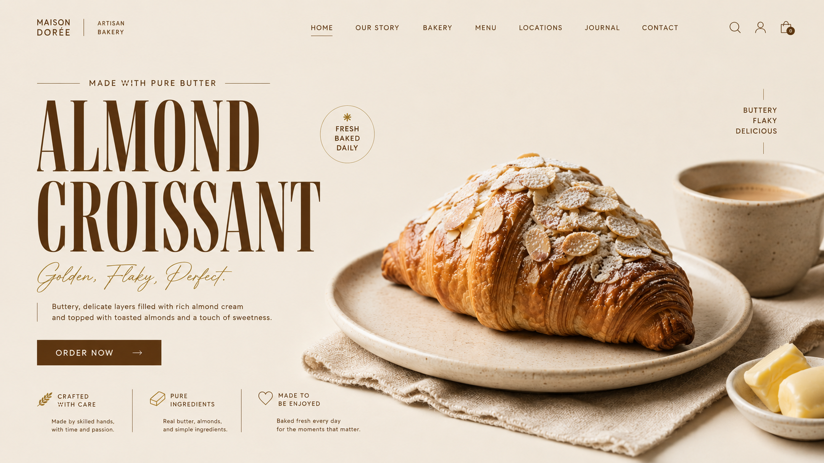
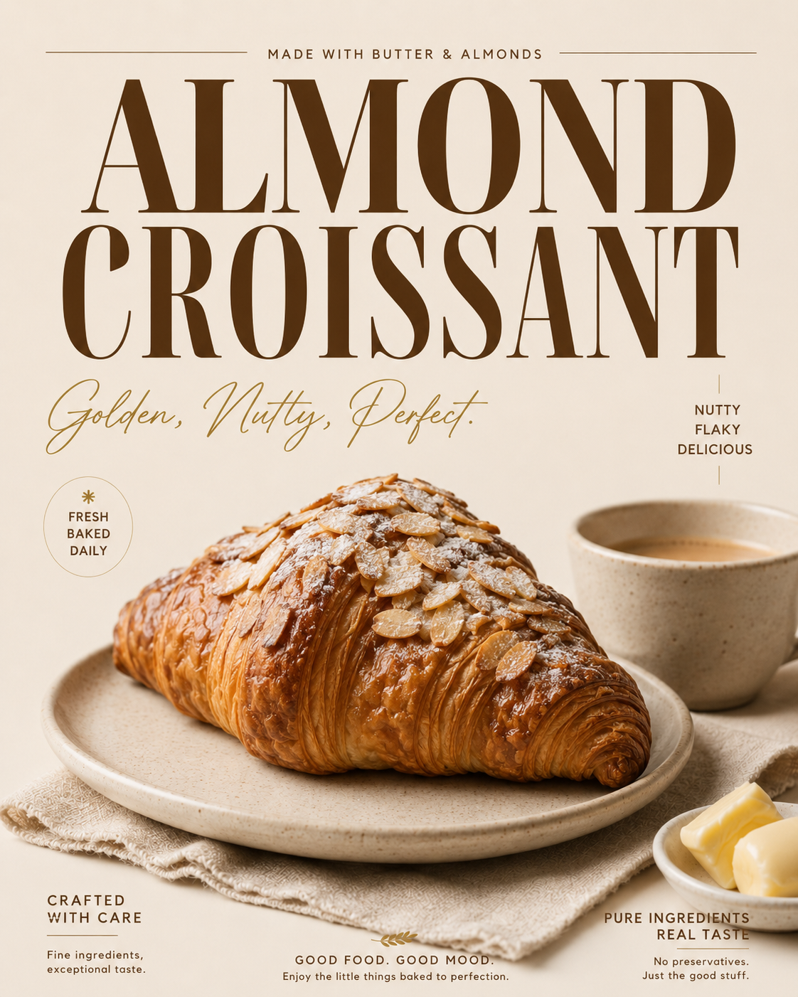
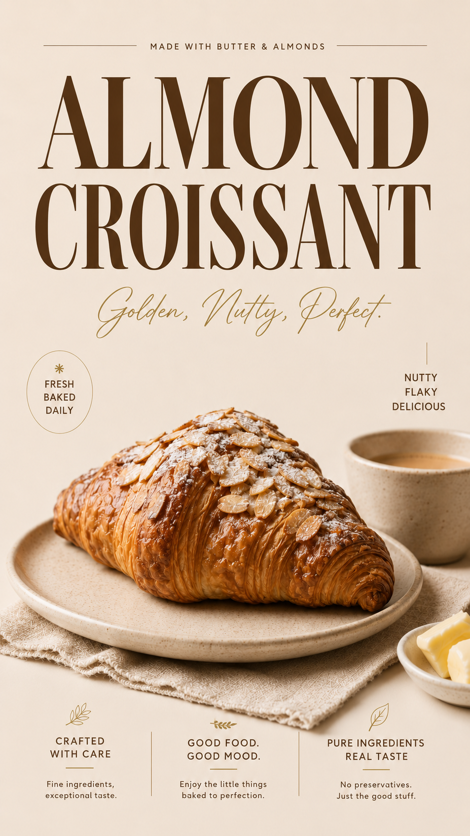
This project highlights my skills in art direction, graphic composition and editorial typography. I created a premium visual identity around the almond croissant, then adapted it consistently across three formats: a 4:5 poster, a 9:16 social media publication and a 16:9 web banner.

Graphic Approach
For this project, I developed a premium graphic direction around the almond croissant, with the aim of creating an elegant, warm and instantly recognisable visual identity. I built a colour palette directly inspired by the product itself: ivory, cream, warm beige, deep brown and golden tones, visually reflecting the flaky texture of the croissant, the toasted almonds and the artisanal atmosphere of a high-end bakery.
Typography was treated as a central part of the composition. The choice of an elegant serif typeface connects the world of pastry with a more premium editorial aesthetic, close to the visual codes of luxury, food advertising and high-end branding. I also worked carefully on visual hierarchy, negative space, contrast and the balance between photography, text and graphic elements in order to give the product a strong presence without overloading the composition.
This approach was then adapted across three complementary formats: a vertical 4:5 editorial poster, a 9:16 vertical social media publication, and a horizontal 16:9 banner designed as a landing page hero section. Each format preserves the same visual consistency while adapting the framing, structure, typography and content distribution to its specific use.
This project highlights my skills in art direction, graphic composition and editorial typography. I created a premium visual identity around the almond croissant, then adapted it consistently across three formats: a 4:5 poster, a 9:16 social media publication and a 16:9 web banner.