




Layout
Graphic Design Skills.
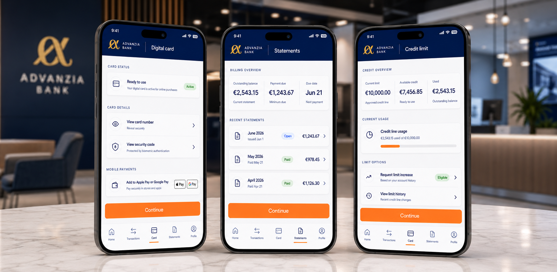
Mobile banking interface designed around a clean, premium and consistent design system. The graphic style is based on clear visual hierarchy, spacious components, line icons and a controlled use of Advanzia blue, complemented by an orange accent for primary actions.



social network add
Graphic Approach
For this project, my graphic approach focused on creating a clear, structured mobile interface adapted to the requirements of a banking environment. The objective was to simplify the key stages of the application in order to make each user journey more readable, more fluid and more enjoyable to use. I deliberately limited the number of visible elements on each screen to avoid information overload and guide the user towards a clearly identifiable main action.
The work is based on precise visual hierarchy, simplified information architecture and consistent navigation across the different sections of the application: transactions, card management, digital card, statements and credit limit. Each screen was designed as a clear step in the user journey, with distinct functional blocks, visible action buttons and immediate access to essential information.
The design system was built around a clean, spacious and professional interface. Components, icons, cards, spacing and active states follow a consistent graphic logic to ensure a seamless experience from one screen to another. The visual identity respects Advanzia’s brand language, using a deep blue to reinforce trust and stability, light surfaces to improve readability, and an orange accent colour for primary actions.
This approach aims to deliver a reassuring, efficient and credible mobile experience while highlighting precise design work: simplified user journeys, interface consistency, strong visual hierarchy and adaptation of the user experience to the real constraints of a mobile banking application.
Mobile banking interface designed around a clean, premium and consistent design system. The graphic style is based on clear visual hierarchy, spacious components, line icons and a controlled use of Advanzia blue, complemented by an orange accent for primary actions.