



Layout
Graphic Design Skills
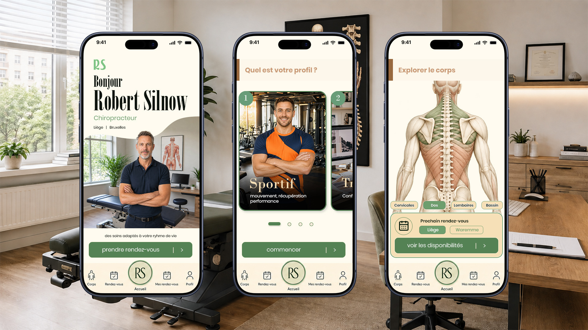
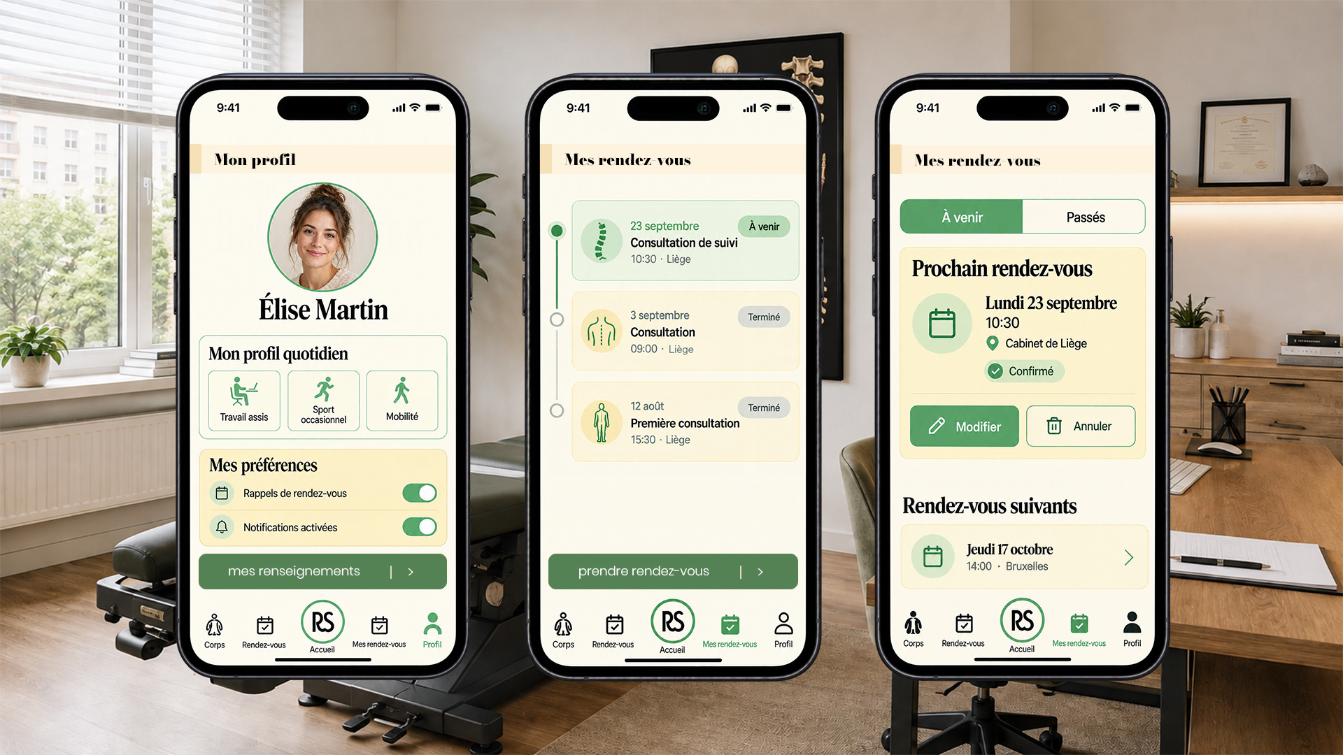
I designed the interfaces for this chiropractic mobile app with a focus on typographic hierarchy, colour balance and precise alignment. The layout combines information cards, icons and action buttons in a spacious composition, maintaining visual consistency across the patient profile and appointment management screens.

Graphic Approach
For this chiropractic mobile app, I began by exploring a colour palette with the client, who then made the final choice of colours and typefaces. My UI design work focused on bringing these elements together to create a cohesive visual identity: shades of green paired with cream and pale yellow backgrounds, with a contrast between expressive serif headings and functional sans-serif text.
We then defined the app’s content and main sections together. I translated this structure into a visual composition built around typographic hierarchy, alignment and spacing. Information is grouped into cards whose borders, backgrounds and proportions establish a clear reading rhythm. Buttons, icons and navigation elements share a consistent visual language across the screens.
The mock-ups presented showcase the user profile and appointment management screens in particular. The portrait personalises the patient’s space, icons support the information, and variations in colour distinguish statuses and available actions. Through these mobile interfaces, my aim was to combine a soft, welcoming art direction with a structured presentation of content, in keeping with the practice’s identity.
I designed the interfaces for this chiropractic mobile app with a focus on typographic hierarchy, colour balance and precise alignment. The layout combines information cards, icons and action buttons in a spacious composition, maintaining visual consistency across the patient profile and appointment management screens.