Categories
landing page | banner | carousel
Layout
Graphic Design Skills.
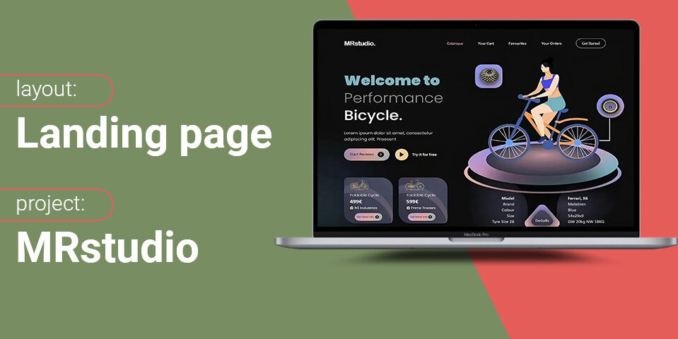
Landing Page of a Bicycle Shop Website

Graphic Approach
For the creation of this landing page dedicated to a bicycle sales website, I adopted a user-centered approach by developing two distinct versions: one in Dark Mode and one in Light Mode. This duality was an obvious choice to provide users with an experience tailored to their preferences and browsing conditions.
I selected an elegant and modern typography that not only reinforces the visual identity of the site but also ensures optimal readability across all devices. The interface was designed to be intuitive and fluid, with clear and accessible navigation elements, making it easier for users to explore the site and discover the products.
The illustrations, created using Midjourney, add a unique and personalized touch to the design, visually enriching the experience while remaining consistent with the bicycle theme. My goal was to combine aesthetics and functionality to deliver a landing page that is both attractive and efficient.
Explore a professionally designed landing page for a bicycle store, featuring a modern interface and intuitive navigation to enhance user experience and product visibility.


