



Layout
Graphic Design Skills.
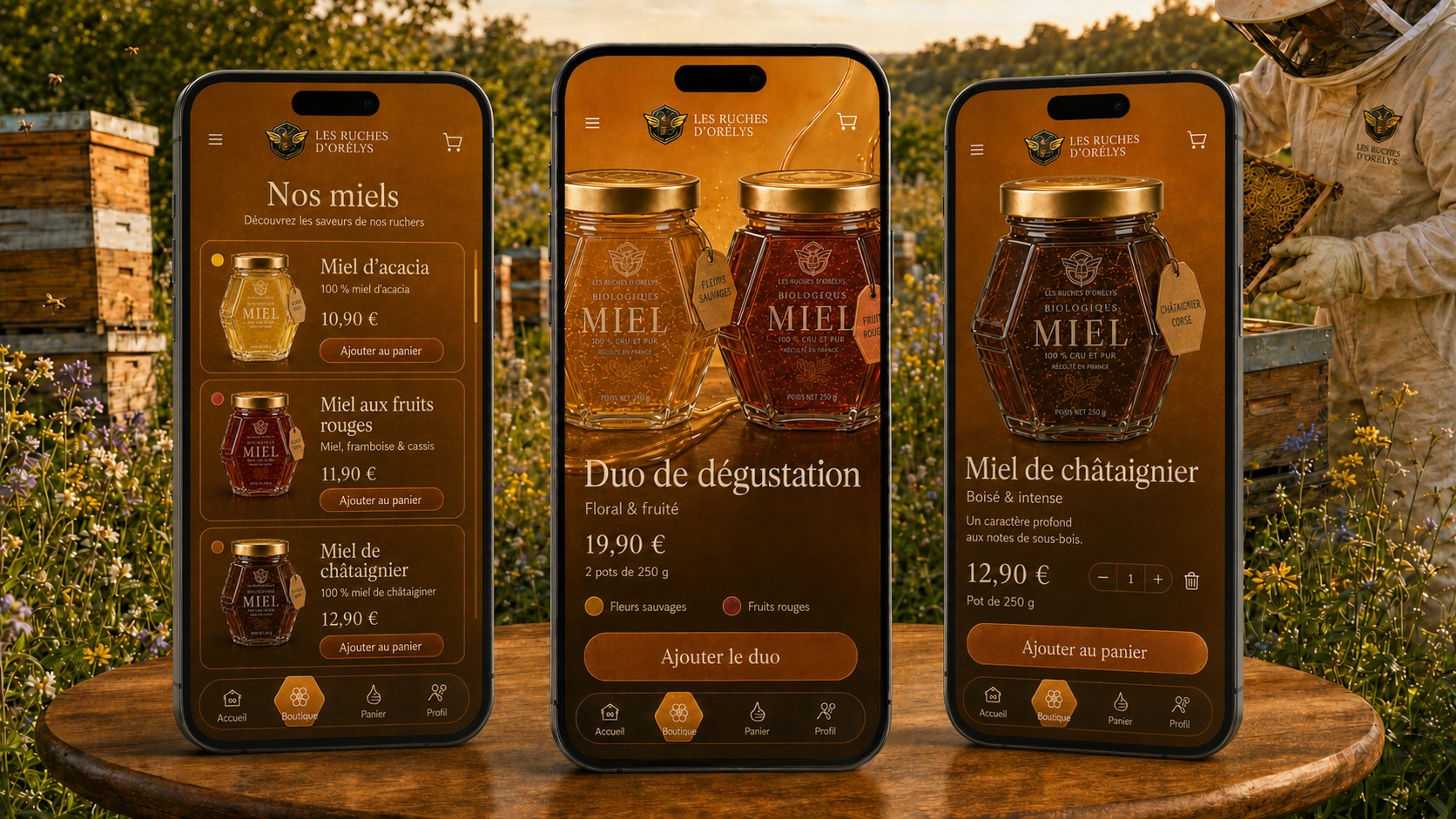
Creation of a cohesive visual identity for the Les Ruches d’Orélys organic honey range, applied across packaging, branded workwear, social media campaigns and the mobile interface. Expertise in art direction, logo and icon design, composition, typographic hierarchy, colour palettes and multi-format adaptation.

Graphic Approach
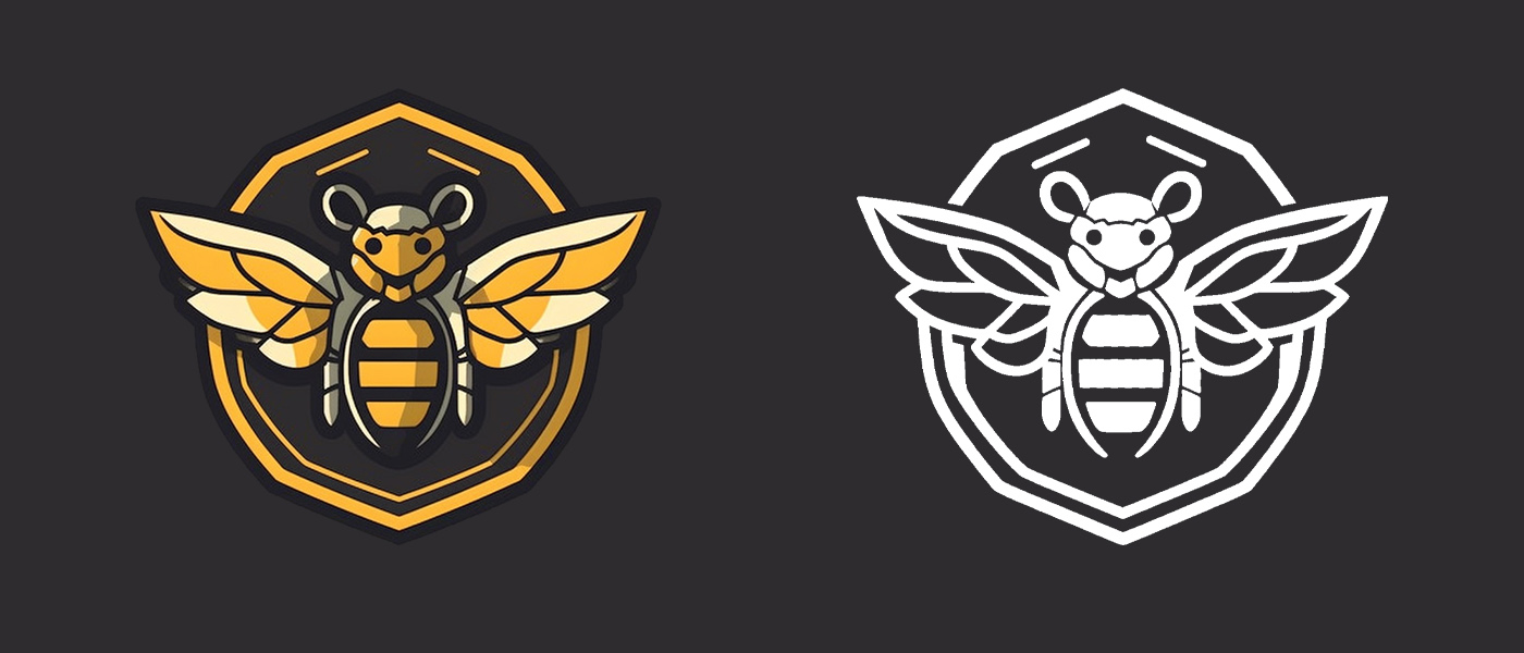
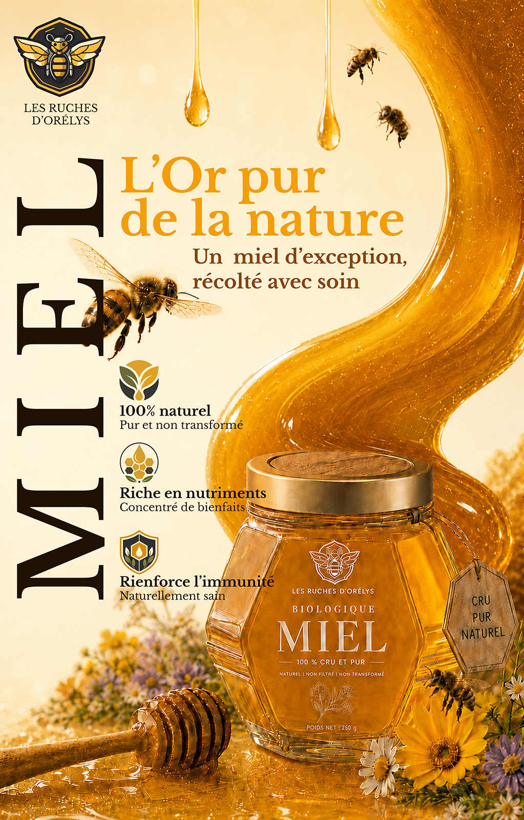
I designed the project’s entire visual identity, from the initial visual research into the representation of the bee to the creation of the logo and its colour and white variations. This central symbol was then adapted across a range of touchpoints to ensure a consistent brand image, including honey jars, professional workwear, advertising campaigns and mobile application interfaces.
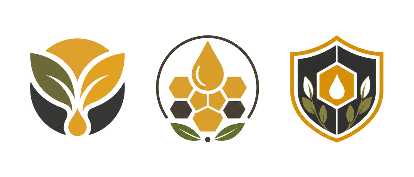
Creating content for social media also led me to develop a bespoke icon system, designed to improve the clarity of the messaging while remaining consistent with the brand’s visual world.
This project allowed me to combine several complementary skills: art direction, logo design, visual identity, campaign design, iconography and UI design. The entire concept is built around a cohesive visual identity inspired by the colours of honey, the textures of the hive and the world of beekeeping, with particular attention paid to maintaining consistency across print and digital media.
Creation of a cohesive visual identity for the Les Ruches d’Orélys organic honey range, applied across packaging, branded workwear, social media campaigns and the mobile interface. Expertise in art direction, logo and icon design, composition, typographic hierarchy, colour palettes and multi-format adaptation.