Colour Trends for 2025: What Do They Reveal?
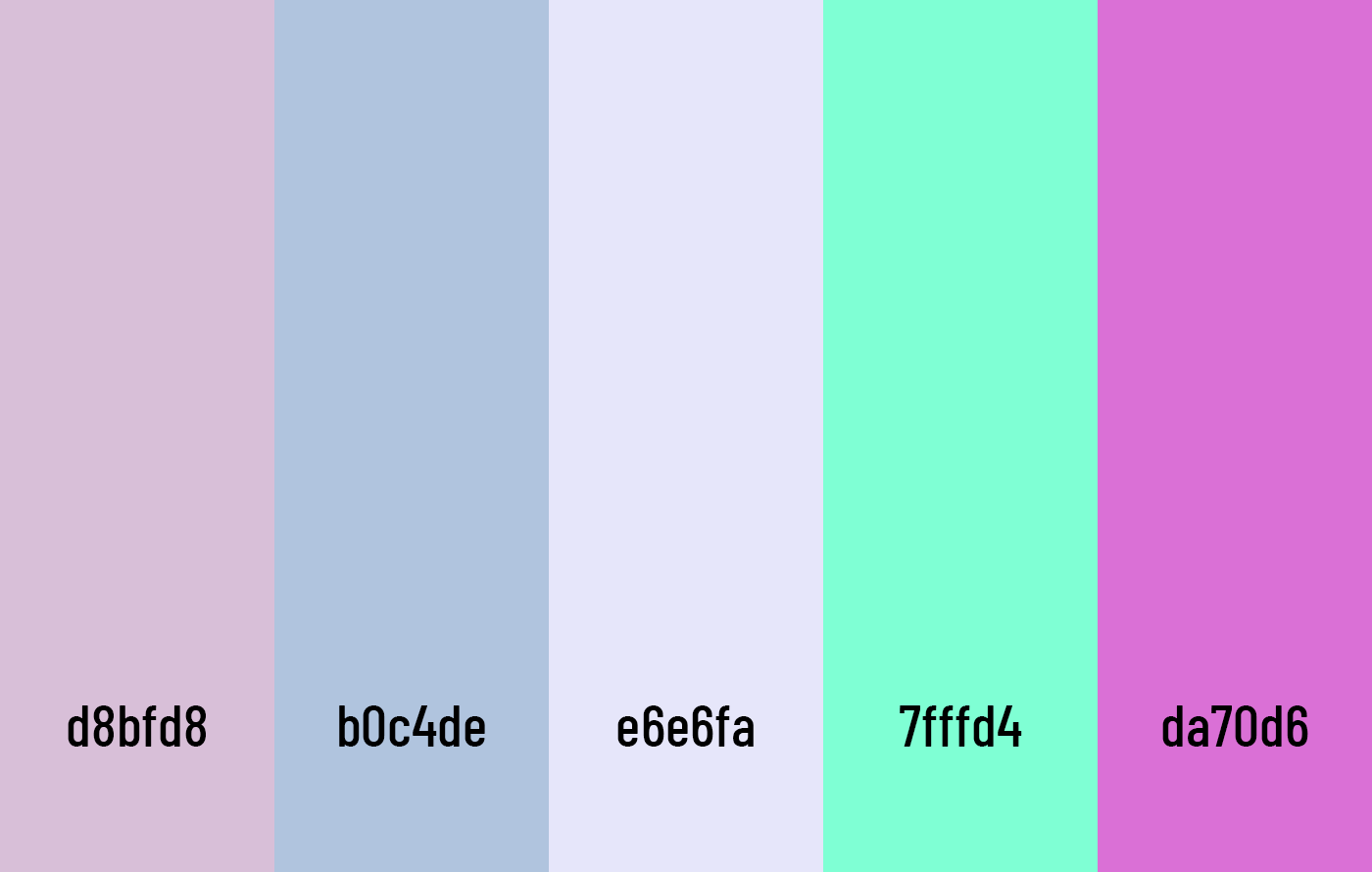
01 | Pastel Tones and Calming Palettes
Seeking serenity in digital design
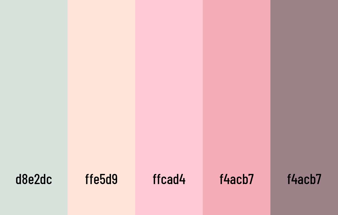
This palette evokes a soothing and warm atmosphere with soft pastel tones. It is ideal for designs related to wellness, mental health, or productivity applications.
In 2025, pastel tones such as mint green, sky blue, and lavender remain highly popular, particularly in designs that aim to create a sense of calm and trust.
These soft and soothing colours address the growing need for peace in a world that feels increasingly fast-paced and overwhelming. Their subtlety allows them to gently guide the user’s eye, reducing visual fatigue and fostering a sense of relaxation. Applications that prioritise well-being, mindfulness, or productivity find these colours especially effective, as they help create an environment that feels safe and supportive while still being visually appealing.
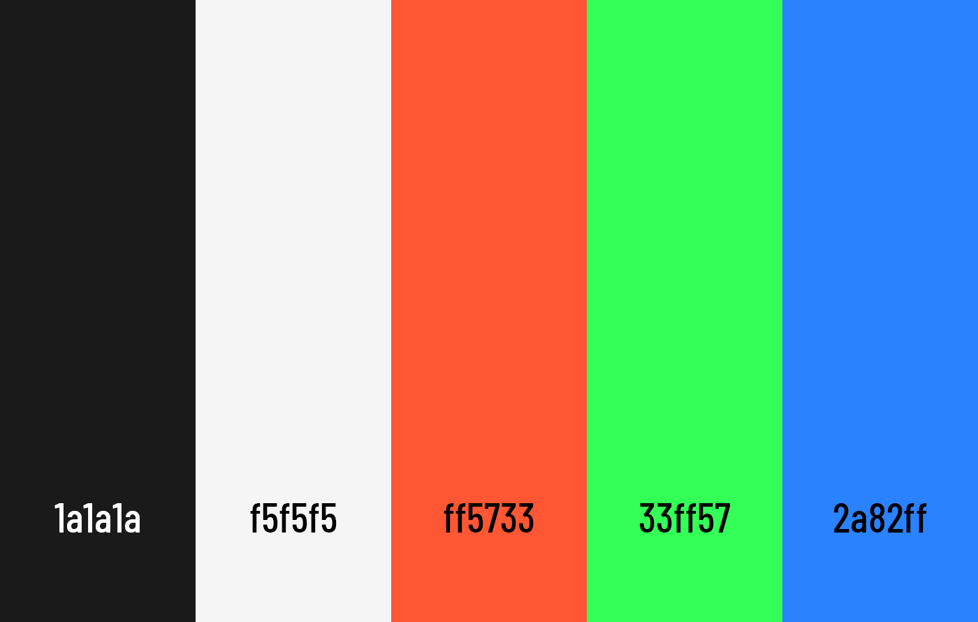
02 | Bold and Saturated Colours
Capturing attention in a visually saturated world
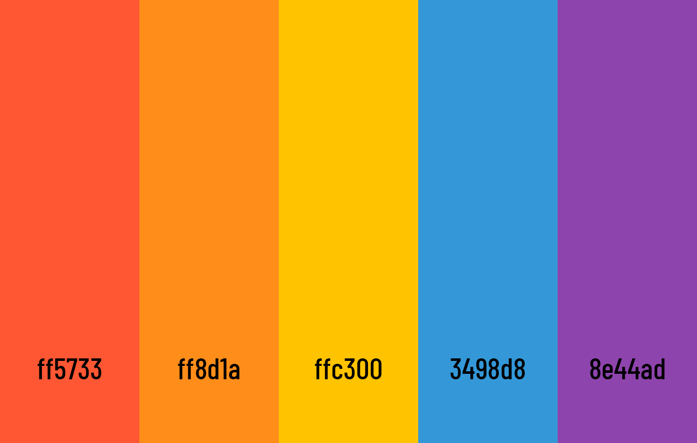
These shades are ideal for capturing attention and conveying a vibrant energy in modern designs.
These bold and energising tones immediately draw the viewer’s attention, making them a perfect choice for brands that thrive on dynamism and innovation. They communicate excitement, confidence, and modernity, helping businesses stand out in a digital landscape where users are constantly bombarded with content. For platforms targeting younger audiences or for those focused on entertainment and action, these vibrant palettes are not just eye-catching but also effective in creating memorable interactions that leave a lasting impact.
03 | Earthy and Natural Tones
A return to essentials and sustainability
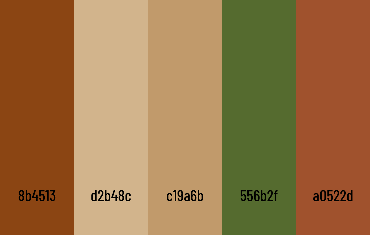
This palette evokes rich, earthy tones inspired by natural landscapes and raw materials, perfect for designs focused on authenticity and sustainability.
With rising environmental awareness and a collective shift towards sustainability, earthy tones like warm browns, mossy greens, and sandy beige are increasingly in demand. These colours evoke feelings of authenticity, groundedness, and connection to nature, making them ideal for brands that prioritise ethical practices and eco-conscious values. The subtle, muted nature of these palettes creates a sense of trust and stability, helping users feel that the brand is aligned with their values. Whether used in e-commerce platforms focused on handmade goods or websites advocating environmental causes, these tones establish a strong visual narrative of responsibility and care.
04 | Metallic and Iridescent Colours
Representing innovation and futurism
Inspired by iridescent effects, this palette highlights soft and luminous shades with holographic reflections, perfect for futuristic or high-end designs.
Metallic and iridescent tones, such as holographic silver and pink-purple gradients, are redefining modern aesthetics by symbolising progress and forward-thinking innovation.
These sophisticated colour choices create a sense of wonder and intrigue, capturing the spirit of cutting-edge technology and advanced design. Their reflective properties add depth and texture, making them ideal for products or platforms looking to convey sophistication and exclusivity. From tech startups to luxury brands, these palettes signal bold ambition and a commitment to staying ahead of the curve, offering a futuristic glimpse into the possibilities of design.
05 | High Contrast for Accessibility
The importance of inclusive and readable designs
This modern palette incorporates slightly softened yet highly contrasting tones, with vibrant shades to capture attention while ensuring excellent readability. Ideal for contemporary and inclusive interfaces.
In 2025, accessibility remains a key priority for digital design, and high-contrast colour combinations are essential to creating inclusive experiences.
By pairing deep, rich tones like navy blue with bright whites or vibrant accents, designers can ensure that interfaces remain clear and legible for all users, including those with visual impairments. This is particularly vital in areas such as public services, educational platforms, and e-commerce, where usability is critical to ensuring engagement. High-contrast palettes not only enhance readability but also demonstrate a brand’s commitment to inclusivity, making interfaces welcoming and effective for a diverse audience.
Leveraging Trends for Your Projects
Colour is not just about aesthetics—it reflects values and user needs. By incorporating the trends of 2025, you can create interfaces that captivate, soothe, or effectively engage your audience. Which palette best represents your project? Feel free to get in touch to explore these possibilities!