
Logos designed to give each brand a clear, consistent and recognisable identity
The logo as a bespoke response
A logo is not limited to a graphic form. It expresses a brand identity, a positioning, a message and an intention.
That is why each creation begins with listening and analysing the specific needs of the project. The logos presented here do not form a catalogue from which one should choose, but a selection of examples created for specific contexts.
You may not find here exactly the logo you have in mind, because a relevant visual identity is not copied: it is built to measure.
Tiger Kingdom
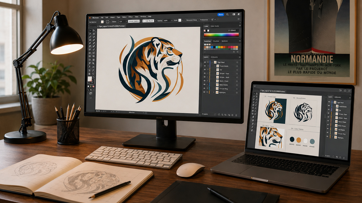
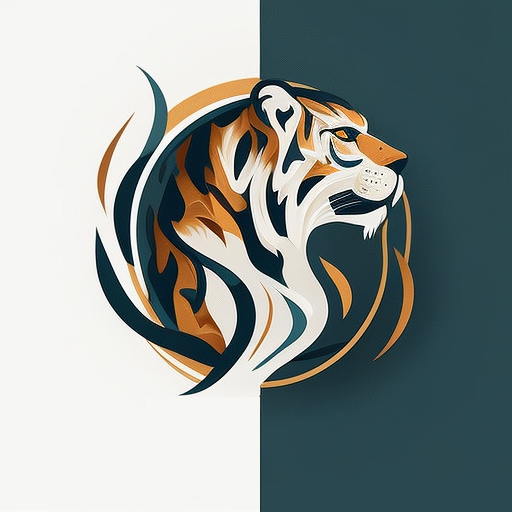
For Tiger Kingdom Chiang Mai, I created a logo based on a stylised tiger icon, directly aligned with the attraction’s identity. As the tiger is at the heart of the experience, it naturally became the central element of the visual identity.
Choosing a graphic rather than realistic treatment creates a more memorable, distinctive and adaptable symbol, while expressing the power, movement and elegance of the animal.
Mountain Leaf Café
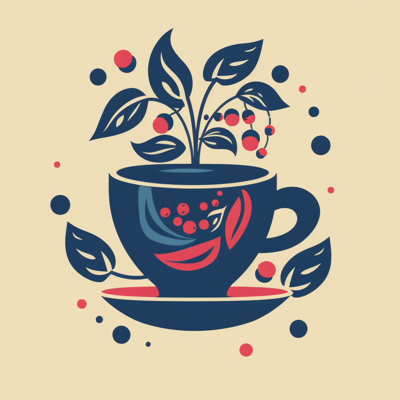
The Mountain Leaf Café logo was designed to express the identity of a secluded café in the mountains of northern Thailand, combining nature, calm and artisanal quality. The cup evokes tea and coffee, while the leaves, berries and botanical shapes reflect the natural surroundings of the place.
The composition is intentionally simple, airy and easily recognisable, creating a soft and memorable brand. The colour palette, inspired by morning mist and mountain light, reinforces the peaceful, warm and refined atmosphere of the café.

Fluxa
This logo evolution remains fully aligned with the identity of Fluxa (a SaaS platform for data flow management and process automation). I chose to focus on the single letter F in order to create a more immediate, compact and memorable version of the brand identity. Its fluid shape conveys movement, speed and circulation, directly reflecting the platform’s purpose and the seamless experience it is designed to provide.
By keeping the same colour palette and overall graphic direction, this evolution preserves the original brand consistency while translating it into a stronger, more concise and more distinctive visual sign.
Spiralis Immo
This logo accurately reflects the identity of Spiralis Immo (property management and building administration) by immediately evoking a staircase seen from above, at the heart of a structured and active building. Its circular construction expresses organisation, circulation and the management of shared spaces, while its distinctive design gives the company a strong and recognisable visual identity.
The project therefore aligns perfectly with the client’s expectations by combining clarity, sector relevance and graphic character.

Lumera Studio
This logo fully aligns with Lumera Studio (photography studio, art direction and visual production), as it draws on the idea of a camera lens through a circular construction inspired by the diaphragm.
The movement of the shapes suggests both light, focus and creative momentum, which immediately reinforces the link with the world of image-making. The overall design gives the company a clear, coherent visual identity that is directly aligned with its activity.
Nova Spirit
This logo is perfectly aligned with Nova Spirit (a brand focused on meditation, personal development and immersive wellbeing experiences), as it brings together the key visual elements of its identity in a single coherent symbol. I chose a lotus-inspired composition to express balance, inner growth and fulfilment, while the fine connecting lines and luminous points introduce ideas of energy, elevation and spiritual connection.
The soft yet vibrant colour palette reinforces this balance between calm and intensity, allowing the logo to reflect both the serene and transformative dimension of the company. The result is a visual identity that responds precisely to the brand’s needs by combining symbolism, clarity and distinctive graphic character.
Les ruches d'Aurélys
Les Ruches d’Orélys is a company that produces its own honey, from tending the hives through to packaging it in jars.
To create its logo, I carried out several studies based on different representations of the bee, in order to find a symbol that was modern, legible and immediately recognisable.
The yellow, black and gold colours are directly inspired by the insect and the natural shades of honey. The hexagonal shape recalls the cells of the hive, while the bee placed at the centre represents traditional craftsmanship and the product’s natural origin.