Categories
landing page | banner | carousel
Layout
Graphic Design Skills for Restaurant Landing Page

Graphic Approach
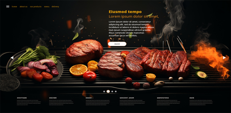
For this banner, the visual approach focuses on appetite and authenticity. Warm and rich colours evoke a sense of conviviality, images showcase culinary delights, and typography is both readable and engaging. Design elements such as wood textures and illustrations reinforce the theme of meat and beer, creating an immersive experience that encourages exploration of the restaurant's menu
Explore stunning graphic design for a meat and beer restaurant’s landing page carousel. See how design can enhance dining experiences.


